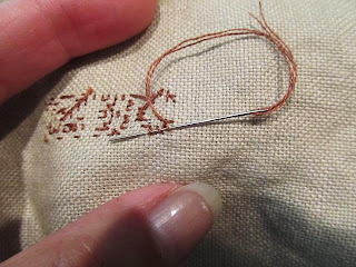
 Hello boys and girls! First off, just wanted to show that I have been stitching behind the scenes. Trying to make new labels, I combined my sampler bag chart with another design. The round boxes are easier to get and are not cock-eyed like some of the ovals. This is the largest 6"x6" but I can adapt this design to the 5" and 4" too. I'm still working on a few others while stitching Mary. Speaking of her...I removed the line of stitching and correctly followed the chart for Mary's name. In the instructions, it does show the "offset" stitches being one thread over from the others, but I still had trouble until I found the secret that no one told me.
 Stitch the border beneath that line first, and you can line up the entire row by following the border stitches. They told me when to be offset and when to line up. Easy peasy. But I'm still not happy. The linen color could be the cause, but these floss hues are not setting well with me. The majority of the verse is blue DMC #161 which I thought was too strong. So I tried 931 dipped in the gray dye. Still not happy. Looked through my color cards and came up empty with the blues. The 611 and 632 are fine, the ecru changed to a gold since it was invisible, but it seemed a blue looked out of place. Nothing really wrong with it and others may like it, but I just thought the blue was too cold, and the brighter blues too bright for my taste. Here's the blue and the cover-up with the 500 series I chose.

So it looks like the end result will not be the colors of the Mary's original design. Does that bother some stitchers? Yep. Does it bother me? Nope. If the stitcher is not pleased with what she is creating in her hand, what is the point? I asked last year if you thought a designer would be insulted by our changing colors after they labored over their design to find what they felt was perfect. This is one of the topics I want to post in the near future. For now, I really like the 501 and 502 in the main body, and may use 503 in place of the gold, or change the gold to a different hue. I love the sampler, want to finish it, and not regret choices when it's on the wall.
 I want to show you my new basket, too. I custom ordered a basket from Ann at 1803 Ohio Farm Baskets for my new nasty cupboard and love it. I chose her long skinny basket with higher sides and shorter handle. For years I've been searching for a basket for the tank lid (of the commode) to hold items and this fits the bill. Perfect side height for the standard tissue box, with lots of room for other items. I can even lay a piece of homespun over the contents. It's staying where I had planned but the width makes it usable almost anywhere, including mantels.
That's all for now. I sure hope I don't forget to draw a name tomorrow! Until then, enjoy your weekend start and thank you for visiting.
xxxxxxxxxxxxxxxxxxxxxxxxxx


